If you have a Good Enough to Share submission, please email it to CorpsLakes@usace.army.mil
Installing Dayboards may be a solution to waterways issues
Example of how to design and install as system of dayboards and buoys on a waterway
Obtaining Corps Brown
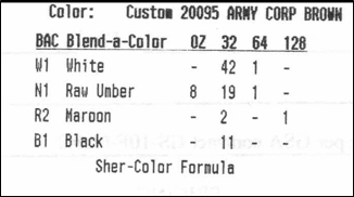 The following is the color formula for "Army Corps Brown" from Sherwin Williams. The mix uses the "Ultradeep" base in the Satin Exterior Latex Superpaint. Please note that this color formula is only good at Sherwin Williams. (GSA contract GS-10F-0004J)
If folks do not have access to or cannot order from Sherwin Williams, they can:
- Purchase "Federal Standard 595B Colors" Fan Deck, NSN 7690-01-162-2210, from GSA.
- Take the fan deck to their local paint store and have them custom match paint to color number 20095
- Share this info with everyone who might use the same paint store.
Placement of safety critical waterway signs at Lock and Dams
Outlines the steps to take to identify safety zones near locks and dams, and to determine the signs needed that will delineate those zones.
Sign Post Replacement Using Telespar®. Rathbun Lake, Iowa
Using the Telespar or similar system of breakaway steel sign posts has been an improvement over pressure treated wooden posts. The relative ease of installation and replacement has saved time and money. The steel posts stand straight and plumbed better than wooden posts for traffic signs and other single post signs.
Tube Kiting Signs
Some Districts are taking action to ban the new practice of "tube kiting" for safety reasons. Proper signage using the guidelines of the Sign Standards Manual is necessary to implement and enforce any such prohibitions.
Here are two suggested signs that meet the guidelines of the National Sign Standards.


Use of the Restricted or Notice signs for this or similar uses is encouraged without obtaining clearance from the National Sign Program Manager to create new legends for these formats. However, the district Sign Manager should be consulted prior to ordering signs with custom text and give approval for Restricted sign messages. "Notice"" signs should follow either Grid A or Grid B on p. 11.3 of the Sign Standards Manual. "Restricted" signs should follow Grid 1 on p. 7.35.
When creating custom "Notice" or "Restricted" signs, keep in mind the principles and guidelines found in Section 2 of the sign manual. Keep legends clear and concise (preferably no more than 10 words) and make sure the sign communicates only one message. Do not cite the authority from our regulations or the possible penalty.
Water Safety Template for marking boat ramps
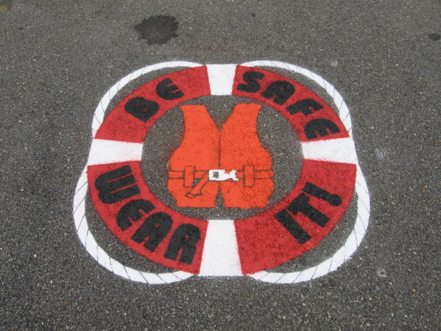 Looking for another way to emphasize PFD use? New England District has an excellent water safety message for use at paved boat launches that is relatively inexpensive! The template is made from 1/4" PVC plastic and measures 47" wide by 56.2" high. There is even a 3-color version available.
Accessibility and Interpretive Signs, Exhibits, and Panels
The use of best practices is encouraged to make interpretive signs and exhibits accessible to as many of our visitors as possible. USACE has no standards for accessibility in signage, interpretive or otherwise.
According to the National Center for Accessibility, there are no ADA guidelines for interpretive signs. Other Federal agencies, including the Smithsonian and the Forest Service, have developed guidelines that may be useful to consider when designing interpretive media.
As in all things interpretive, the first step in planning is to know your audience. Will the panel be accessible by wheelchairs, and will it be such that a wheelchair user will want to pull right up to? In that case, the front edge will need to be high enough to clear the knees, 27". Otherwise, a bit lower would work if the intended audience is children or is to be viewed at a bit more distance, including people in wheelchairs.
The Smithsonian Institution (SI) has developed guidelines for interpretive exhibits. SI recommends the bottom edge of interpretive panels and vertical cases in museums/visitor centers be 27". This also facilitates travel by visually impaired people who use canes.
The US Forest Service has some good, brief guidelines. It states that the mounting height of angled (30 - 45 degrees) panels be 24 to 30". For low profile (flat) exhibits, USFS recommends the front height be 32", SI states a maximum of 36".
Recommendations For Wayside Exhibits/Interpretive Signs:
- Follow the USFS guidelines:
- Height 24 - 36" above ground level,
- Panel at 30 - 45 degree angle.
- Optimum height of bottom edge of frame for wayside exhibit above pavement or floor is 27". That is a good recommendation for vertical panels such as orientation signs, also.
- Select type size appropriate to the viewing distance. Typically they will be:
- Typeface should be no smaller than 24 pt. for captions;
- Typeface should be no smaller than 36 pt. for text;
- Subtitles: 40-48 point;
- Titles should be at least 60-72 point, If the title is more than 80� above ground level, letter size should be at least 3�.
- For signs at greater distance to the viewer, font size will increase proportionally. At a minimum distance of 1 meter, double the size.
- Create color contrast between text and background. The best color combinations are black or blue and white, or white on brown.
- People who have low vision will need larger type than other visitors at every distance. When calculating distance, consider also the effects of crowds on actual viewing distance.
For more information, see the references below.
A vitrine, mentioned in the SI guidelines, is a glass showcase. By wayside exhibits we mean those outdoor interpretive signs that are usually placed at an angle from the horizontal so as to be easily read, but not obstruct the view.
U.S. Forest Service interpretive design guidelines
Excerpts from the Smithsonian Institute guidelines for Accessible Exhibition Design. This document is considered the best practice for designing exhibits. It includes information about fonts and lettering, mounting heights, distances, contrasts etc. Much of this document is applicable to signage, see especially section b.